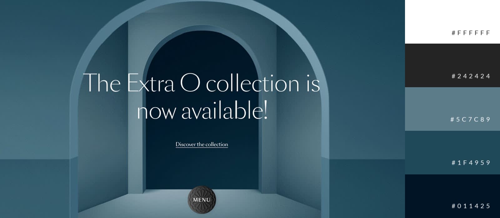
The Psychology of Color: How to Choose the Right Palette for Your Website
The psychology of color plays a crucial role in web design, as different colors evoke distinct emotions and associations. Understanding how specific colors influence perception can significantly impact user experience and engagement. For example, blue often conveys trust and professionalism, making it a popular choice for corporate websites, while bright colors like orange and yellow can create a sense of energy and excitement. When choosing a color palette, consider your target audience and the message you want to convey. A well-thought-out color scheme not only enhances aesthetics but also guides users towards desired actions, such as signing up for a newsletter or making a purchase.
To select the right colors for your website, start by defining your brand personality and the emotions you wish to evoke. Here are some steps to help you choose effectively:
- Research Color Theory: Familiarize yourself with basic color theories, such as the color wheel, complementary colors, and harmony.
- Understand Your Audience: Analyze your target demographic to determine what colors resonate with them.
- Test Combinations: Create a few variations of your palette and test how they perform with real users.
By harnessing the power of the psychology of color, you can create a website that not only looks visually appealing but also effectively communicates your brand's identity and engages your visitors.
Top 5 Color Scheme Trends for 2024: What’s Hot for Your Website Design
As we look ahead to 2024, color scheme trends are set to make a significant impact on website design. This year, we are witnessing a shift towards more vibrant and bold palettes that evoke emotions and enhance user experience. Natural tones combined with bright accents are becoming increasingly popular, allowing brands to convey authenticity while still standing out. The use of gradients is also on the rise, enabling designers to create depth and dimension across their digital spaces.
Here are the top 5 color scheme trends to consider for your website design in 2024:
- Earthy Tones: Warm, natural colors that resonate with sustainability.
- Vintage Pastels: Soft, nostalgic shades that create a retro aesthetic.
- Monochromatic Madness: Variations of a single hue to maintain cohesiveness while adding interest.
- Bold Contrasts: High-contrast palettes that demand attention and enhance navigability.
- Tech Blues: Cool colors inspired by technology, perfect for modern, sleek designs.
What Makes a Website’s Color Palette Effective? Essential Tips for Success
Choosing the right color palette is crucial for the effectiveness of a website. The colors you select can influence a user's perception of your brand and impact their overall experience. A well-thought-out color scheme enhances user engagement and can lead to higher conversion rates. To create an effective color palette, consider the psychology of colors; for instance, blue evokes trust, while red can stimulate excitement. Using tools like color wheels or online palette generators can aid in finding complementary colors that work harmoniously together.
In addition to color psychology, it's essential to ensure your website’s color palette promotes readability and accessibility. High contrast between text and background colors increases legibility, making it easier for users to consume your content. Furthermore, consider using a limited color palette, ideally 3 to 5 colors, to maintain a cohesive look. Remember, consistency across your website, including branding elements like logos and banners, strengthens your visual identity and fosters trust among visitors.
