Bgroho Insights
Your daily source for news, tips, and inspiration.
Color Me Crazy: Choosing the Perfect Palette for Your Website
Unlock the secret to stunning web design! Discover how to choose the perfect color palette to captivate your audience.
Understanding the Psychology of Color in Web Design
The psychology of color plays a crucial role in web design, influencing how users perceive and interact with a website. Different colors evoke specific emotions and associations; for instance, blue often symbolizes trust and dependability, making it a popular choice for corporate websites. In contrast, vibrant colors like red can create a sense of urgency, compelling users to take immediate action. Understanding these associations allows designers to strategically select colors that align with their brand identity and resonate with their target audience.
Moreover, color can impact user experience and conversion rates significantly. A well-thought-out color palette can guide users' eyes toward important elements, such as call-to-action buttons and key information. Utilizing color theory effectively also involves considering the cultural context of your audience, as different cultures may interpret colors differently. By integrating the psychology of color into your web design strategy, you can create a more engaging and persuasive online experience, ultimately enhancing user satisfaction and loyalty.

Top Color Combinations to Elevate Your Website's Aesthetics
Choosing the right color combinations for your website can significantly impact its overall aesthetics and user experience. Top color combinations not only enhance the visual appeal but also communicate the brand's identity effectively. Some popular combinations include:
- Blue and White: This classic pairing creates a clean, professional look ideal for corporate websites.
- Green and Beige: This natural combo is perfect for eco-friendly or health-focused sites.
- Red and Black: Bold and striking, this combination works well for websites wanting to convey energy and passion.
Another excellent choice is the Monochromatic Scheme, where different shades of a single color can create depth and harmony. For instance, a palette of varying blues can evoke tranquility, making it a prime choice for wellness or therapeutic platforms. Additionally, you can experiment with complementary or analogous colors to create contrast and interest. Always remember that the goal of selecting the right combination is to elevate your website's aesthetics while ensuring readability and accessibility for your audience.
How to Choose the Right Color Palette for Your Brand Identity
Choosing the right color palette for your brand identity is a crucial step in creating a lasting impression. The colors you select will evoke specific emotions and associations for your audience, making it essential to understand the psychology behind color choices. For instance, blue often conveys trust and reliability, while red can evoke passion and energy. To start, consider your brand's core values and the emotions you wish to communicate. You might want to create a mood board or a list of colors that resonate with your brand message as a foundation for your palette.
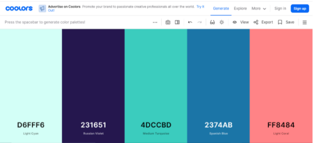
Once you have a preliminary list of colors, narrow it down to three or four main colors that will represent your brand consistently across all platforms. You can use tools like Canva or Adobe Color to experiment with various combinations and see how they work together. It's also wise to look at your competitors and assess their color schemes – while you want to stand out, gaining inspiration from others can provide valuable insights. Remember, your color palette should work harmoniously with your brand identity and adapt well to both digital and print formats, ensuring a cohesive appearance across all mediums.